Flagship Suite

Brand Launch / Package Refresh
Project Type
Role
Project Design Lead
The Problem
Adobe Creative Suite, iPad Pro, Affinity Design, & Procreate
Year
2023-2024
Tools Used
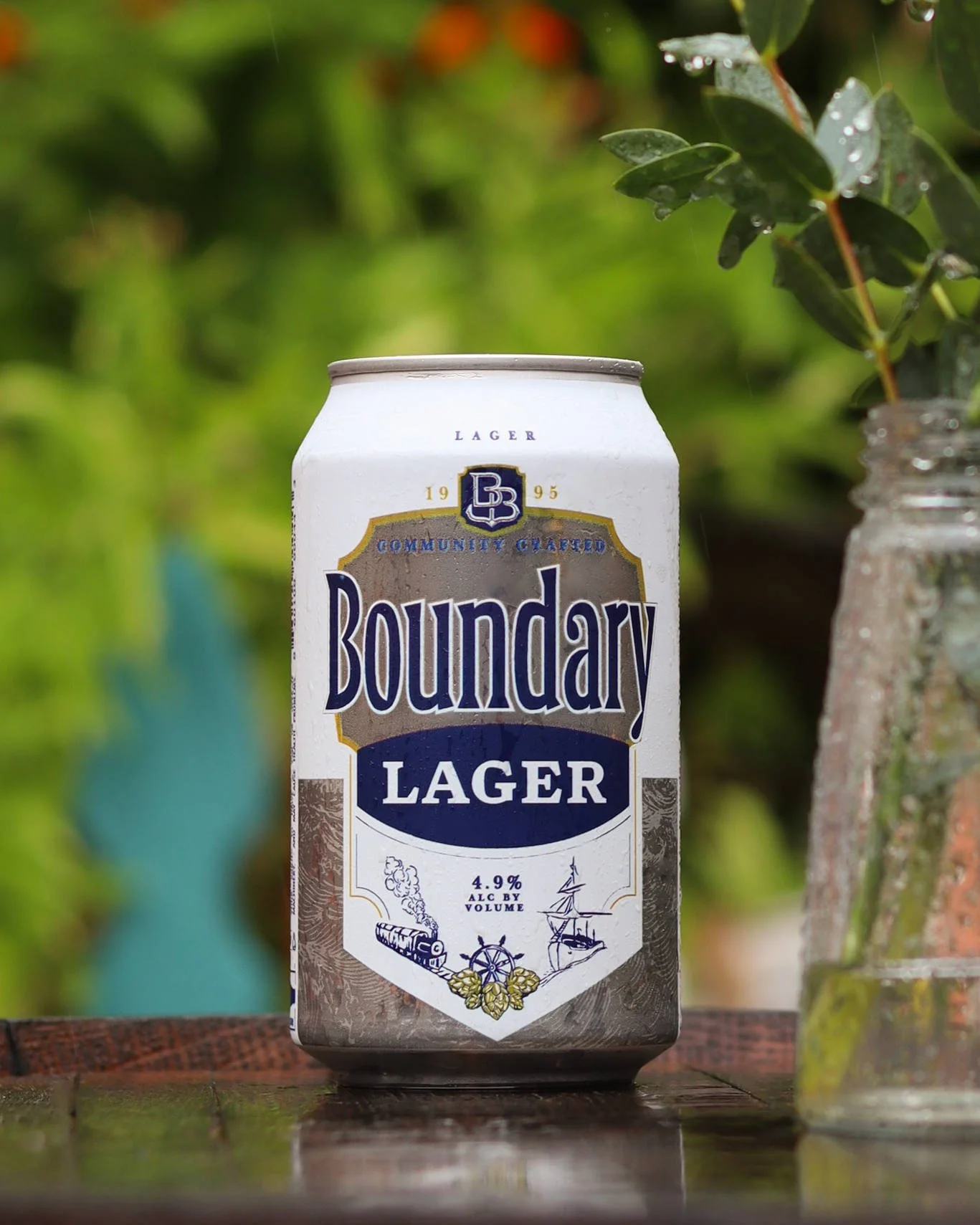
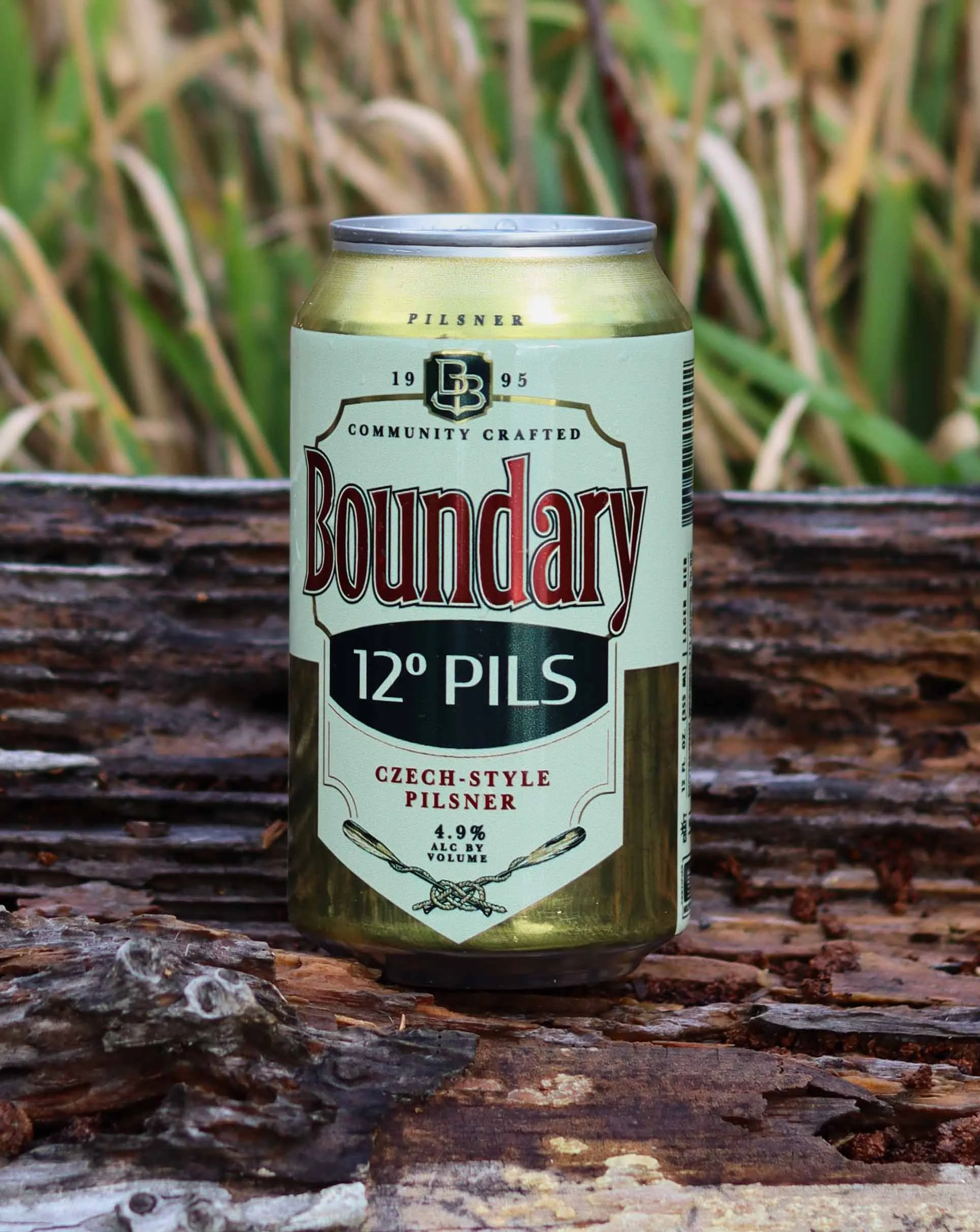
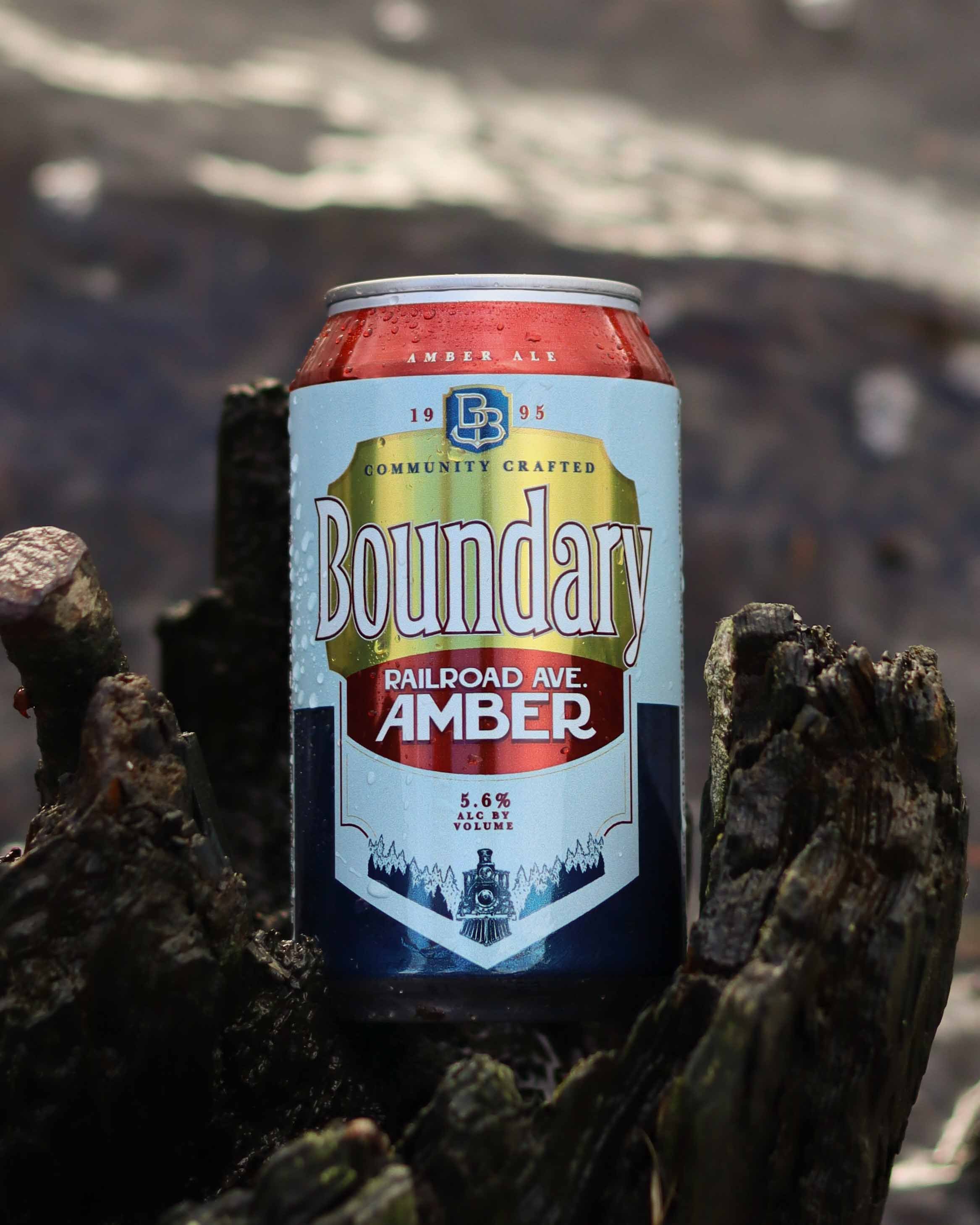
Aside from its three original flagship beers, Boundary Bay struggled to have a brand identity that newer flagship beers could be recognized by. The original trio is based on the complex and hand drawn art made at the inception of the company. Those designs stood alone as natural classics that had been with the brand since its inception, and previous attempts to package beers using the same design formula always fell flat on the market. Boundary Bay needed a refresh for these newly packaged beers — something that would draw eyes and be a reminder of Boundary Bay’s award-winning taplist in a state saturated with craft beer, while allowing the well-loved and recognizable original flagship designs to stand alone.
The Solution
By delving deep into the history of canned beer design, I determined a consistent and simple “old-school” design formula that irresistible classic brands followed. The text hierarchy always guided the consumer eye to first the brand name, then the beer name, then beer type. Anything else present on the label had to complement those elements and support them, making sure to not detract from them. Using that formula, I crafted a suite of can designs that stands strong and eye-catching on store shelves. Together with the Brand Manager, I made the decision to shorten “Boundary Bay” to simply “Boundary” — the nickname by which the community has come to recognize the business after nearly 30 years of service. Each can is distinguished by its color palette, unique nameplate, and distinct hand drawn illustration at the base of each composition. To tie the cans together and connect them to Boundary Bay’s flagships, the designs of the new cans are all unified by the woodblock-carved waves embossed into the lower half, mimicking the woodblock-style original illustrations.

See more details of each design here: